Thursday, May 2, 2013
Monday, April 29, 2013
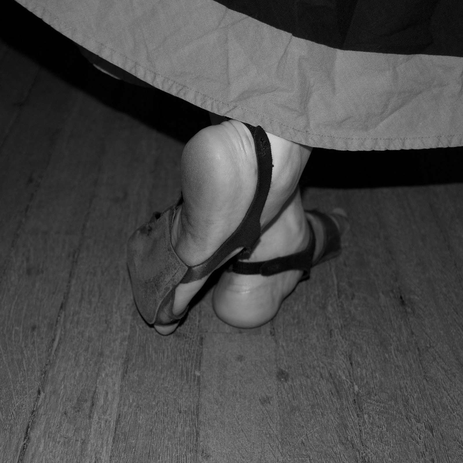
The Mythology of Divorce Children
This is a project for my Digital Imagings Class
This is a project for my Digital Imagings Class
It incorporates 1.) stop motion paper cut animation 2.) appropriated YouTube videos 3.) a voice over and sampled music from M83
Monday, April 22, 2013


Tuesday, April 16, 2013


Monday, April 15, 2013
Friday, April 12, 2013
I'm really getting into this project because stop motion animation is just so damn fun!
Here are directions:
1.) set up properties--> file, project properties, timing
2.) click and drag images into new project
3.) set duration--> double click on 1st image and inspector window will show up, change to .1 seconds for duration and check the box to apply this to all the stills
4.) for problems of slight zooming in--> select 1st image (shift) select last one, window, "cropping, ken burns & rotation" fit, done
5.) Export--> share tab, export movie, title, mobile (more views/more likes that way), desktop (or wherever you want to save it)
6.) The End!!
Thursday, April 11, 2013
Helpful tutorials for how to do basic stop motion on iMovie
http://www.youtube.com/watch?v=t3-UZB1O-aE (adding music)
http://www.youtube.com/watch?v=ipE3nCjI0IU (extremely helpful, just the basics)
So here's a lil' demo I made to practice
It's called The Sherbet Disaster! (fixed)
http://www.youtube.com/watch?v=t3-UZB1O-aE (adding music)
http://www.youtube.com/watch?v=ipE3nCjI0IU (extremely helpful, just the basics)
So here's a lil' demo I made to practice
It's called The Sherbet Disaster! (fixed)
to fix: select 1st one (shift) select last one, window, "cropping, ken burns & rotation", fit, done
Wednesday, April 10, 2013
Monday, April 8, 2013


Wednesday, April 3, 2013
Tuesday, April 2, 2013
Response to the KUTLUG ATAMAN
by mark prince


Since I've never seen any work by Kutlug Ataman I felt a little out of the loop regarding the article about him and all his specific work so this prompted an investigation of him and his films. I am very much interested in the intersection of art and film and this is right up my alley. I am also really interested in philosophy which made me really appreciate the reference to Richard Rorty (the American philosopher who proposed "self-creative" through metaphor as an alternative to the concept of an essential human nature, he also saw identity as a possible language construction--similar to the imaginative narratives produced by a poet or fiction writer) in the first paragraph. For me art has to have a purpose it
just can't be aesthetic it needs to be grounded and rooted in a rich topic that can help one learn more about themselves and others. That is something that I think Kutlug Ataman does very well. All of his pieces seem to have some deeper meaning to them which makes me appreciate him even more.
Kutlug Ataman is a Turkish film artist who works are formally diverse but what he likes to do is to focus a video camera on a selected individual and listen to their story. His belief is that our attempts at self-definition depend entirely on language and there is no vantage point external to language from which we can qualify that discourse. He does not believe that people have definite identities, he believes that we are rewriting our identity at every moment. His work reflects and addresses "a given community". I found it interesting that Ataman sees personality as the result of our hapless attempts to control our fears and desires. I find many of his projects to be very interesting such as: Women Who Wear Wigs, Paradise (2006), Beggars, Testimony (2006), The Four Seasons of Veronica Read (2002), Never My Soul (2001). I found the reoccurring theme of competing voices on different monitors to be very fascinating. This concept is used in both Women Who Wear Wigs and Paradise (2006). It really is a meditation on the consequences of perceptual overload, both the viewer's and the subjects'.
In regards to our upcoming project using adobe after effects, I want to do a piece that deals with a story/topic that is very important to me, something that I have been writing and drawing a lot this semester. I want to illustrate this concept called The Mythology of Divorce Children which is a story that I developed about a family solar system and how the father is like the sun and the mother like the moon. I would like to work in the style of Michel Gondry but as of yet i still am conjuring up ideas for how to go about this in my sketch book.
Monday, April 1, 2013
Response to North Korea Marine Landing Photoshop: AFP Pulls Photo, Cites Evidence of Tampering
April 1st (Happy April Fool's Day!)
I found this article to be really revealing of our time. With all of our new crazy technology we can create images that are completely fake and fool people (hmm interesting correlation to April Fool's Day). With tools like PhotoShop that are now easily torrented or bought people can learn and use them for good or for bad. This photoshopped North Korean Marine Landing is a prime example of how this technology can be used for the latter. So many people rely on virtual ways of getting their news and if it is tampered or incorrect then this can cause people to mistrust the information that they are receiving and or they can blindly follow it which causes all sorts of other problems. My mom is really into political conspiracies at the moment and this is especially evident in her case. I've been trying to remind her that you cannot always trust what you see on YouTube. Some people just get their kicks from tampering with the facts and this can be harmful for the people who don't look further into it.


Revised Propaganda Project #1 Men With Funny Hats
with added Tumblr site that links you to a 6 posts about Shriners, Free Masons, The Illuminati, The New World Order etc. with photographs and informative information that I created to further illustrate the message I want to give. I also added an illuminati eye watermark to further illustrate my propaganda message.
Thursday, March 28, 2013
Mike Kelley: The Escape Artist
By: Kelly Crow


I found this article, in particular, to be so powerful. This article came to me at a very serendipitous time. I've been marinating on this romanticism that people have regarding artists and depression. I've been thinking about this a lot because I go through my own highs and lows, being an artist with natural bi-polar tendencies. It's interesting how famous and wealthy he became but his depression kept growing and eventually killed him. I feel like I've been so obsessed with money and financial matters lately that I think that "if I just had enough money all my problems would be solved", "if only I became a successful artist all my problems would be solved" but this is a prime example of that. Then this led me to think about depression medication and "if only he was just put on depression meds he would not have killed himself" but then "would he have made such critically acclaimed art?" This also brings up another question "after being so successful how do you keep impressing the audience? and what do you do when you lose faith in art/your own art?"
Artists are such fascinating and complicated creatures. They are such intuitive and emotional creatures that they sometimes feel too much and sometimes this is great because they can produce art that touches people and evokes a reaction but they can also feel too much of the bad shit of this world and it clogs their pours like a sponge. I feel like I looked at his life like a case study. I was a psych major before I switched to art and maybe this has an influence on how I'm reacting to this article. I feel like his vibrant life story and art greatly contrasts his dark depression and ultimate suicidal end. I want to use this as inspiration to keep level and to learn from his life story (his successes and failures).
Monday, March 25, 2013
Response to today's critique for the Propaganda Project
I think that today's critique went well. I received a lot of good constructive criticism that I really want to implement in the near future. I think I relied too heavily on prior knowledge of the audience regarding the Illuminati and New World Order and Free Masons. I am afraid that I might have been just a tad too subtle in my attempt and could use some of the suggestions to make it clearer and educate the audience.
For the first piece (the rebellious fraction, the dissenting view with the Men In Funny Hats) I would like to add a subliminal watermark of an Illuminati eye symbol, up the opacity of the paper filter and I would like to put a link at the bottom with web address to a Blog/Tumblr site where I could post information about the Illuminati and free masons and Shriners and new world order.
For the second piece (celebrating a governing system) I would like to curve the circus font and change the color to orange. I would also want to address the text at the bottom that the class said looked tacked on as an after thought. I also might add an illuminate eye. I'm not sure if I agree with the class in regards to it feeling too cluttered. I think that is the vibe that a circus gives me and I want to transfer that onto the poster for a circus.
All in all, I think critiques are great because you get a lot of different opinions and in my opinion you should take what you like and leave the rest. If you agree with a suggestion and so does the majority of the class then you should at least try to impalement it, but besides that stick with your vision and keep tweaking until it feels right to you.
Wednesday, March 20, 2013


Monday, March 18, 2013
Response to "What Convicts Can Teach Us About Graphic Design
I found the article to be really revealing and somewhat funny. It really shows the power of aesthetics and how they can be used/manipulated to disguise the actual product being sold. What Neil Stansfield did was sneaky and down right awful because he undermined an already troubled organic market and the honest work of a lot of passionate food producers. But what he did was also a hilarious because it showed how branding can increase the perceived value of a product. It's just the startling revelation that I think many of us american's need today because we are too trusting and lazy to do the research and we also need to re-evalute our obsession with brands.
It is really fascinating how the packaging can really influence a purchase. The right colors, font and photo can really transform the retail price of an object and influence the person purchasing. I really appreciated the quote from Malcolm Gladwell from is book Blink. I am currently reading The Tipping Point by him and it is very informative and I feel like I'm actually learning as I read because it keeps repeating the beginning stories/case studies and it links everything together. The psychological impact a label has on us is quite a scary thing.
I really appreciated this article because it was a perfect lesson that teaches us the incomparable value of good branding and design.


Sunday, March 17, 2013

Thursday, March 14, 2013

I found Gary Hustwit’s Helvetica documentary to be extremely insightful and eye opening. I never knew how important and influential a typeface could be to the general public and to the graphic designers of our world. This video comes to me at a very poignant time because in one of my other classes (VS Seminar 2) I am writing and illustrating a kid’s book that requires me to pay attention to what font I use and how I use it because it could change the atmosphere/vibe of the piece.
I learned a lot by watching this video as well. My understanding of typeface and graphic design was broadened by exposure to this documentary. I never realized that typefaces express a mood and atmosphere. Typeface give words a certain coloring. I found this quote important, “Graphic design is the communication frame work through which these messages about what the world is now and what we should aspire to. It’s the way they reach us.” I never realized how crucial text is to the advertising world.
I’d also never really heard of the word “Typography” before, which is “the art and technique of arranging type in order to make language visible. The arrangement of type involves the selection of typefaces, point size, line length, leading (line spacing), adjusting the spaces between groups of letters (tracking) and adjusting the space between pairs of letters (kerning).” I liked how Massimo Vignelli compared the space between the letters/words to music notes and breaks. I thought it was interesting how he described the life of a designer and how it is a job of fight. His main objective as a designer is to cure the visual disease with design.
Helvetica is the type that we see the most because it is very ubiquitous. I never realized how opinioned people could be about typeface. It never seemed to be that important to me but as I continued to watch the documentary I soon discovered its importance especially because it was conceived post World War 2 as a solution to a world problem. Helvetica’s history is very intriguing. In 1950s (post WW2) idealism spread among graphic designers as a need to rebuild, reconstruct and this was embodied in typography. It is a Swiss style that was born in, none other than, you guessed it, “Switzerland”. Helvetica means the “Swiss” typeface. The Swiss pay more attention to the background/ the white space then the black of the letter which is the very opposite way of thinking in America. “It is a letter that lives in a powerful matrix of surrounding space”. I never realized how much of an art form typography is.
I found it interesting that even our taxes are done in Helvetica and that big corporations and ads use it because it is so ubiquitous, friendly, calming, neutral and human. I like the way the typographers (Jonathan Hoefler and Tobias Frere-Jones) describe typeface. They used very qualitative terms that are entirely subjective.
I also found it interesting when they started to interview people who were not so happy with the sensation of Helvetica. The flip side is that Helvetica is so ubiquitous and uniform that all the letters look the same like an army. This is important to take note of because it was created right after WW2. Typeface could be used as a weapon to implant bad ideas by big corporations into our heads. Some said it was the typeface of socialism because it is available all over, inviting everyone to typography/ to create. For example Paula Scher (a design graduate from Tyler School of Art) had a vendetta against Helvetica because those who used it were sponsors of the Vietnam War. Another problem with Helvetica is that it is so formatted and so over used that it is not unique anymore. There was a movement called Post modernism where people went against Helvetica. Grunge typography was an example of this. Then in the late 90’s there was another change from grunge/chaos in text to more order (back to Helvetica).
Wim Crouwel also touched on the Stijl movement which I’ve never heard of which in turn led me to do some research. It is Dutch for "The Style", also known as “neoplasticism”, and was a Dutch artistic movement founded in 1917. In a narrower sense, the term De Stijl is used to refer to a body of work from 1917 to 1931 founded in the Netherlands.
All in all, I took a lot of notes while watching this documentary and did a lot of research to broaden my understanding of graphic design and text so that I can improve my own work and to become knowledgeable of the topic.
Monday, March 11, 2013


Wednesday, March 6, 2013

2 Images and text for LOGO
1.) text envelope distort with text
*rectangle
*words
*anchor point
*just text, type, command bracket, so text is behind the shape
*object, envelope, distort, make with top object
2.) image trace
*object, image trace, high fidelity, black and white
*object expand so you can highlight all parts
3.) blend options with stars
*three stars, connect with line, no color for stroke, highlight all
*object, blend, blend options, 65 circles,
*object, make (so it shows up)

Thursday, February 28, 2013


Wednesday, February 27, 2013

Monday, February 25, 2013

Friday, February 22, 2013


Wednesday, February 20, 2013
Response to Critique
I think that overall my critique went very well. I got good advice for the issues regarding saturation and concept. I believe my concept was well received and captured by the audience which I was a tad nervous about. I'm glad it wasn't too obvious but the class had a good grasp on the idea. From the critique I discovered that it might be a good idea to lower the saturation if I was going to print this out for a show or to hang on the wall because it might change from screen to paper. The class also brought up the question of balance (part of my concept) and how there were more figures on the bottom left then on the bottom right. We discussed about the difference in odd and even numbers regarding graphic arts and fine art. I think this is something useful to hold onto because it can change the way the viewer views your piece. If they are distracted by the balanced or unbalanced composition then this can make them not like the piece. Another suggestion that I might take into consideration, if I were to do this again, is to add more arms of the cranes to play off the concept of me having multiple arms. All in all, I really appreciated everyone's constructive criticisms and will try to employ those suggestions in future projects.
Thursday, February 14, 2013


Wednesday, February 13, 2013

Friday, February 8, 2013


Subscribe to:
Comments (Atom)